
Editorial: Hospital Metropolitano
ISSN (impreso) 1390-2989 - ISSN (electrónico)2737-6303
Edición: Vol. 29 Nº 2 (2021) Abril - Junio
DOI: https://doi.org/10.47464/MetroCiencia/vol29/3/2021/53-62
URL: https://revistametrociencia.com.ec/index.php/revista/article/view/210
Pág: 53-62
María Carolina Velasco1  , Isaac Zhao2
Latin American Center for Clinical Research. Quito - Ecuador1
Worcester Polytechnic Institute. Worcester, MA - United States2
Este artículo es una guía práctica sobre el análisis exploratorio de datos (EDA) para investigadores con conocimientos básicos en estadística. EDA ayuda a examinar las relaciones, los patrones y las anomalías de los datos con el fin de determinar la dirección de la investigación y los métodos estadísticos a seguir. Mediante ejemplos prácticos con código en R, el estudio equipa a los lectores con el conocimiento y las habilidades para extraer información valiosa de estadísticas descriptivas y visualizaciones.
Palabras claves: Análisis exploratorio de datos, estadística descriptiva, tendencia central, variación.
The present paper is a practical guide on exploratory data analysis (EDA) for researchers with limited background in statistics. EDA helps examine data relationships, patterns, and anomalies to, ultimately, determine the next steps and direction of the research. By providing hands-on examples and sample code in R, the paper equips readers with the knowledge and skills to draw insights from basic yet essential data summaries and visualizations.
Keywords: Exploratory data analysis, descriptive statistics, central tendency, variation.
| María Carolina Velasco: | https://orcid.org/0000-0002-8482-9865 |
| Isaac Zhao: | https://orcid.org/0000-0002-4352-4969 |
| Correspondencia: | Maria Carolina Velasco |
| e-mail: | ma.carolina.velasco@gmail.com |
INTRODUCTION
The present paper is a practical introduction to descriptive statistics for biological or health-related data. The methods and tools discussed herein cover basic yet essential steps involved in exploratory data analysis (EDA). EDA is an iterative process in which researchers (a) generate questions about a scientific problem; (b) search for answers by exploring the relationships in the data at hand; and (c) use the acquired knowledge to refine the initial question or pose new questions5. EDA is fundamental to the data analysis process because it suggests the logical next steps and direction of the research. It allows us to assess data quality, identify data patterns, validate assumptions, and ponder over statistical methods to apply to the data. Ultimately, it can give us a good idea of which questions the data can answer and which ones it cannot.
There are several statistical programs in which data analysis can be performed. This paper provides sample code in R to give readers a practical tool box for the methods discussed in the following sections. R is free and one of the most popular softwares among statisticians. R can be installed from https://www.r-project.org/. We recommend using RStudio Desktop, which is a free, friendly user interface for R programming available for download at https://www.rstudio.com/products/rstudio/download/. We use base R in the paper. However, note that there are multiple R packages for data wrangling and visualization like dplyr and ggplot2. You can find coding guides for these packages and more in the
Resources section.
Throughout the paper we will be drawing from Shahbaba’s introductory book to biostatistics using R4. Additionally, we analyze the dataset called “Survival from Malignant Melanoma” (referred to as melanoma moving forward) to exemplify methods and tools. The dataset contains demographic and tumor characteristics of patients with malignant melanoma who had their tumours surgically removed at the University Hospital of Odense, Denmark, from 1962 to 19771. This dataset is publicly available in the “boot” package in R. Follow the code below to access the dataset.
Sampling
Research starts with a question. Ideally, we would like to answer it using information from the entire population of interest. However, this is oftentimes not feasible due to the limited availability of resources or to ethical considerations. A representative sample of the population is selected instead. With caution, the conclusions reached via statistical inference methods can be then applied to the population from where the sample was obtained. The melanoma dataset contains attributes of 205 patients with malignant melanoma in Denmark. Hence, any inference reached from this dataset cannot be generalized to patients with benign melanoma or even to patients in other Denmark hospitals if, for instance, the University Hospital treats more aggressive cases than other hospitals.
Samples are selected randomly and, unless noted otherwise, the members are assumed to be independent of each other. That is, the selection of one participant does not affect the selection of another one. For each subject or observation, we collect various characteristics that are related to the question of interest. Often called variables, these traits can take any form and value. For instance, the melanoma dataset contains the variable “thickness”, which measures the tumour thickness in millimeters and has been found to be an important prognostic factor of malignant melanoma1. Statistical inference allows us to understand how tumour thickness is related to the presence of malignant melanoma in the target population. Variables follow distributions, which tell us the possible values a variable can take and the likelihood of observing those values in a random sample from the population.
Univariate Exploratory Data Analysis
The first step of EDA consists of visualizing and summarizing the data. Data visualizations give us a high-level understanding of data patterns, whereas data summaries make it manageable to describe large amounts of data. It is helpful to start EDA by analyzing one variable at a time. Variables can be either categorical or numerical, and they can be further classified as described in Figure 1.
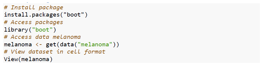
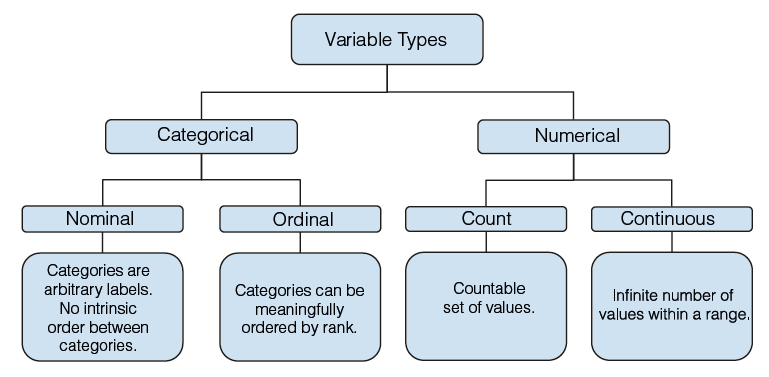
Figure 1. Variable types.

In the data panel at the right hand side of RStudio, we can also check the variable types and values for several of the first observations.
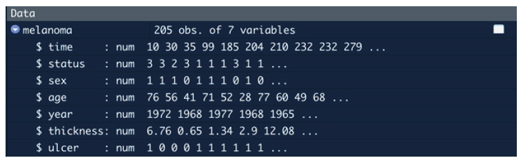
Figure 2. Data variables and variable types observed in the data panel of RStudio.
Note that all variables are numerical because R was not able to automatically recognize categorical variables as such. Therefore, we need to convert them to categorical.
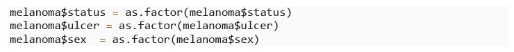
The variables status (1 = died from melanoma, 2 = still alive, 3 = died from causes other than melanoma), sex (1 = male, 0 = female), and ulcer (ulcer in tumour, 1 = present, 0 = absent) are nominal variables because they are groupings that do not preserve any rank ordering. On the other hand, if we were to group age into categories (i.e. 1 = age <18, 2 = age between 18 & 65, 3 = age > 65), we would have an ordinal variable where categories follow a meaningful order. By exploring the behaviour of age as a categorical variable versus a numerical variable, we can decide which variable type to keep in a statistical model.
Let’s consider the numerical variables age (in years), thickness (tumour thickness in millimeters), and time (survival time in days). Among them, age and time are count variables, whereas thickness is a continuous variable because it has uncountable set of numbers between two values1. This means that, between any two values of this variable, we can still find an in-between value.
Exploring Categorical Variables
Frequencies and Relative Frequencies
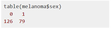
Categorical variables can be summarized by counting the number of times each level or category has been observed in the data. In the melanoma dataset, you probably wonder how many participants are female and how many are male. This number is called a frequency. The frequency table below shows that in the dataset, there are 126 female and 79 male observations.
If we wanted to know this information in terms of proportions or percentages, we can create a relative frequency table as the one below that indicates that, of the total sample size of n=205 participants, 61% is female and the remaining 39% is male. Relative frequencies are proportions of the sample size. Hence, they will always sum to 1.

Bar Graphs
The frequencies of categorical variables are visualized in bar graphs. The x-axis displays each category, while the y-axis represents the observed frequencies or relative frequencies.
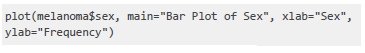
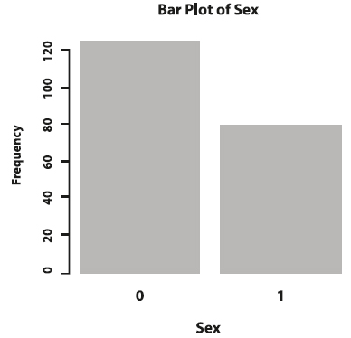
Figure 3. Bar plot of sex.
The relative frequencies of categorical variables can also be plotted in pie charts.
Exploring Numerical Variables
Numerical variables can be summarized by the central tendency and the variation of the values. Central tendency refers to the location at which most of the values are gathered and variation refers to the spread or dispersion of the values around the center of the distribution.
Measures of Central Tendency and Location
The main measures of central tendency are the sample mean and the sample median. The sample mean is the average of all the values of a numerical variable. It is computed like any average by adding all the values and then dividing by the sample size. The mean age of the melanoma patients is 53.5 years2.
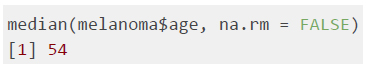
The sample median is the middlemost value of a distribution. It is calculated by first sorting the observed values in ascending order. If the sample size is an uneven number, then the sample median is the number at the middle of the sorted observations. In the melanoma dataset, the median age of participants is 54.
1 In the context of probability and statistical inference, categorical variables - both nominal and ordinal - and count numerical variables are considered discrete random variables. Continuous numerical variables are considered continuous random variables.
2 The function mean() in R supports the option to remove missing values. Missing values are an important part of EDA and there are various statistical methods to deal with them that are not within the scope of this paper. In the melanoma dataset there are no missing values.
Besides the measures of central tendency, the distribution of a numerical variable can be summarized by other measures of location like the minimum, maximum, and specific quantile.
The minimum is the smallest value that a variable takes in the sample. Likewise, the maximum is the largest value of a variable in the sample.

A quantile is the score at which variable values are divided into equally sized, adjacent subgroups. For example, the median is the 0.5 quantile because it splits the data in half. If we were to divide the sorted values of a variable in fourths, we would obtain 4 quartiles, where each quartile represents the following: Q1 is the value below which 25% of the data falls, Q2 is the median, Q3 is the value below which 75% of the data falls, Q4 is the maximum value. The interquartile range (IQR) is the difference between Q3 and Q1 and gives us a sense of the spread of the data.

Figure 4. Quantiles and the 5-Number Summary.
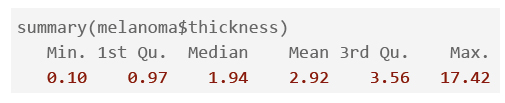
As seen in Figure 4, the IQR is 35 (difference between 63 and 28). We can describe the distribution of a numerical variable with the minimum, Q1, Q2, Q3, and the maximum. These metrics are commonly called the 5-number summary. The summary() function in R renders the 5-number summary along with the mean.
Box Plots
A graphic representation of the 5-number summary and other location statistics is called a box plot (Figure 5).
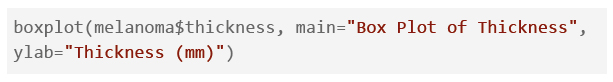

Figure 5. Box plot of thickness.
The thick line inside the box represents the median of 2.92. The box stretches from Q1=0.97 to Q3=3.56, so its length represents the IQR and encompasses the middle 50% of the values of the sorted observations. The dashed lines coming out from the box are commonly known as whiskers. The bottom whisker extends to either the minimum or to the value Q1-(1.5 x IQR), whichever is reached first. Likewise, the top whisker extends to whichever value is reached first, the maximum or the value Q3+(1.5 x IQR).
Taking a deeper look into the distribution of thickness, we notice that, although 75% of the observations are smaller than Q3= 3.56mm, the maximum value is far off at 17.42mm. This suggests that there are unusually high values that do not seem to follow the overall variable distribution. These values are represented by the hollow circles in the plot. Values that are too large or too small are called outliers; they can be data entry errors or unusual observations that skew or slant the distribution of a variable3. As a rule of thumb, outliers are values that are smaller than Q1 or larger than Q3 or that fall 3 or more standard deviations from the mean (we cover standard deviation later in this section). Although the sample mean is a very useful statistic for central tendency, it is very sensitive to unusual values. The sample median and IQR are more robust measures.
Histograms
We can visualize the effect of outliers on the sample mean and median by comparing the distribution of age and thickness. Histograms are commonly used to visualize numerical variables because their shape shows the overall location and spread of a variable. Histograms are similar to bar graphs; the x-axis groups the values into a defined number of intervals or bins and the y-axis shows the frequency or number of the observations that fall within each bin. The sum of the bar heights is equal to the sample size n. It is always important to play around with the binwidths of histograms since they can reveal different patterns.
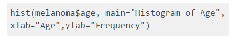
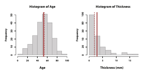
Figure 6. Histograms of age and thickness. The solid line is the mean, while the dotted line is the median.
Figure 6 shows the histograms of age and thickness. We notice that the sample mean (solid line) and median (dotted line) of age are pretty close to each other whereas the ones of thickness are far apart. In fact, the distribution of thickness is stretched to the right. This is called a right-skewed distribution. Although the majority of observations are centered around the sample median of 2mm, the large outliers give the histogram a long right tail and move the sample mean towards the right. That is, the mean moves more towards the direction of the outliers than the median does. In the case of a left-skewed distribution (not pictured), the sample mean is smaller than the sample median because the left tail shifts the mean towards the left.
For age, we see a symmetric distribution around the center of the data where the left side roughly mirrors the right side. Indeed, the sample mean and sample median (as well as the sample mode) are very close to each other. Hence, all of these metrics can be representations of the center of the distribution.
Both symmetric and skewed histograms are unimodal because they have one peak. If a distribution has two peaks, then it is described as bimodal4.
3 There are various ways of handling outliers; if they are data errors, we can drop or trim them. However, if unusual values are true outliers, we should keep them because they provide important information about the distribution of the variable. There is no golden rule for the treatment of outliers and the methods vary based on the question of interest and the nature of the data.
4 Usually, a bimodal histogram suggests that there are two heterogeneous subpopulations within the population. Bimodal or multimodal distributions are out of the scope of the present paper.
Measures of Variation
Besides understanding basic summary statistics of central tendency and location, it is fundamental for EDA to understand the dispersion of the values of a numerical variable. When collecting sample data, the values of a numerical variable will vary among each other. The sample standard deviation (s) measures the average distance of each data point xi and the sample mean x. That is, the larger the standard deviation, the further away the values are from the mean (i.e. the larger the dispersion). Viceversa, the smaller the standard deviation, the more concentrated the data is around the mean. The formula of the sample standard deviation is the following:
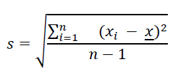
Note that the denominator in the sample variance is n -1 instead of the sample size n because we need to increase the dispersion measurement by a small amount to account for the fact that we are dealing with a sample instead of a population. The sample standard deviation of age is 16.7 years. The mean age is 52 years. In a symmetric distribution like the one of age, displayed in Figure 6, it is estimated that 68% of the observations falls within one standard deviation from the mean (x ± s). That is, roughly speaking, 68% of participants in the study are aged between 35 and 69 years. Likewise, approximately 95% of the observations fall within two standard deviations from the mean (x ± 2s), in this case, 18 and 86 years old.

The sample variance s2 is the squared sample standard deviation. Hence, the sample variance is measured in squared units of the variable of interest. To measure dispersion in the same units as the original data, we report the standard deviation. Note that because the sample variance and standard deviation take into account the mean, both measures are sensitive to outliers.
Section Summary

Figure 7. Summary of univariate exploratory data analysis.
Bivariate Exploratory Data Analysis
In the univariate analysis performed in section 3, we were able to answer the following questions via summary statistics and visualizations:
Now, imagine that we wanted to answer more elaborate questions like the ones below:
To explore these inquiries, it is necessary to evaluate the relationships between variables in what is called bivariate EDA. Note that, rather than making formal conclusions, the objective of this stage is to identify possible relationships and measure their strength. Just like in univariate EDA, the statistics and visualizations used to explore the observed data in bivariate EDA vary by the type of variables we are analyzing.
Two categorical variables
Contingency tables are used to investigate the possible relationship between two categorical variables. Consider the variables sex and ulcer. Each cell in the table shows the frequency of each level combination of sex (1 = male, 0 = female) and ulcer (ulcer in tumour, 1 = present, 0 = absent). For example, 79 participants were female and their tumours did not have ulcers.

We can analyze the same information with sample proportions. A visual way of displaying them is with a stacked bar plot as shown in Figure 8. Each bar is divided into two sub-bars stacked end to end. Each sub-bar represents the proportion of the categorical variable a for a level of the second categorical variable b.
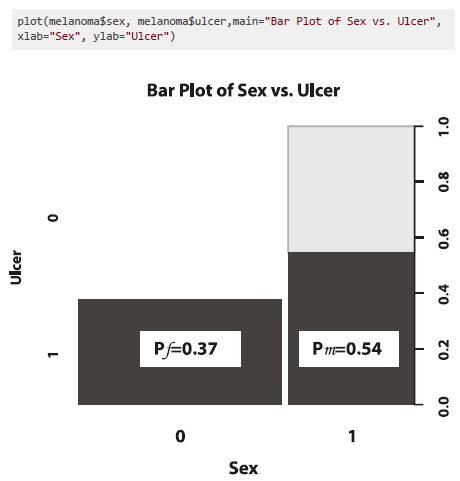
The proportion of female participants that had an ulcerated tumour was pf = 47/126 = 0.37. The proportion of male participants with ulcerated tumours was pm = 43/79 = 0.54. Since, pm > pf, we can say that the risk of having an ulcer in a melanoma tumour was larger for male than female participants. This suggests a potential relationship between sex and ulcer, which can be measured with a difference in proportions (pm - pf) or, more commonly, a relative proportion (pm / pf). The relative proportion of having an ulcerated tumour is 0.54/0.37=1.46, which means that the risk is 1.46 times higher for men than women. The relative proportion is often referred to as the relative risk (RR).
Another common relative measure for binary categorical variables is the sample odds, which is the ratio of the likelihood that the event will happen (p) to the likelihood that the event will not happen (1 - p). For instance, the sample odds of an ulcerated melanoma tumour in women is σf = pf / (1 - pf) =0.37 / (1-0.37)=0.58 and in men is σm = pm / (1 - pm) =0.54 / (1-0.54)=1.17. We can compare both odds by computing the popular measure called sample odds ratio (OR). The odds of having an ulcerated tumour is 2 times higher for men than women.

Both the relative risk and odds ratio measure the strength of the relationship between two binary variables. If the RR or OR is equal to 1, it means that there is no relationship between the two categorical variables. On the contrary, a RR or OR that is smaller or larger than 1 suggests a strong relationship between the two variables.
What is, then, the difference between the two measures and when should we report each one? As described by Ranganathan et al., for rare events, the RR and OR are similar3. However, for more common events, the odds ratio tends to show a stronger relationship than the relative risk. Indeed, in the example of tumour ulceration by sex, the OR of 2 is larger than the RR of 1.46. Although the relative risk can be a more accurate measure in such cases, it is oftentimes not feasible to compute this measure because it requires to know the total number of both exposed and non-exposed groups (i.e. both levels of a binary variable).
One categorical and one numerical variable
To explore the relationship between a categorical and a numerical variable, we compare the distribution of the numerical variable for each level of the categorical variable. If the distribution changes by level, we hypothesize that the two variables are related. Let’s explore the question, is survival status associated with the age of patients? As shown in the table below, the mean age is different for each status level; people who died from melanoma or from other causes are, on average, older than the ones who were still alive at the end of the study.
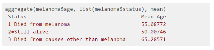
We can compute the difference of sample means between status levels. For instance, patients who died from causes other than melanoma are 15 years older than people who were still alive, on average. This difference suggests that there is a relationship between age and survival. However, among which categorical levels? Side-by-side box plots help examine this question further. As Figure 9 displays, the interquartile range (i.e. the box’s height) of age for status level 3 is smaller than the one of levels 1 and 2. This means the age distribution of level 3 is less spread out and, therefore, it has less overlap with the age distributions of levels 1 and 2. Now, if we compare levels 1 and 2 among each other, we notice that their distributions overlap considerably, suggesting that the age of participants in levels 1 and 2 may not be much different. Hypothesis testing would be necessary to corroborate these observations.

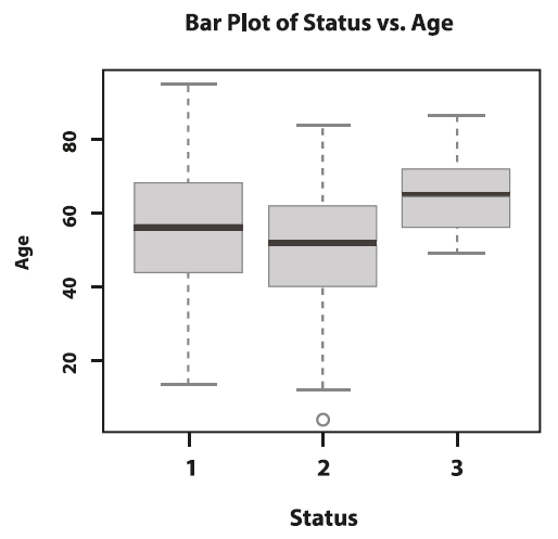
Figure 9. Side-by-side box plots of age by status.
Two numerical variables
We usually examine the possible relationship between two numerical variables by plotting them against each other in a scatterplot. Scatterplots show the direction, strength, pattern, and deviation of a relationship of two numerical variables. In Figure 10, each point on the scatterplot represents one participant in the sample. The x-axis represents the values of tumour thickness and the y-axis the values of age.

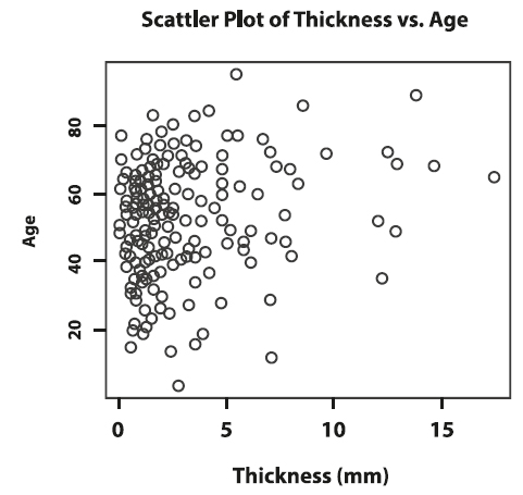
Figure 10. Scatterplot of thickness versus age.
We notice that bigger tumours are mostly observed in older patients, which implies a positive relationship between thickness and age. However, because the top left portion of the plot shows that older patients can also have smaller tumours, we do not expect the positive relationship between thickness and age to be very strong. A negative relationship would happen if, overall, younger patients would have thicker tumours.
If the points in a scatterplot are distributed resembling a straight line with a non-zero slope, we say that the two variables have a linear relationship. A horizontal line indicates that there is no linear association between two numerical variables. It is often the case that we find non-linear relationships when doing EDA. For instance, the pattern in a scatterplot can resemble an exponential or a logistic function. One of the objectives of EDA is to identify the function that best reflects the observed bivariate relationship.
We can quantify the strength of a linear relationship with Pearson’s correlation coefficient. This summary statistic ranges from -1 to 1 and the sign indicates the direction of the relationship. The larger the value is away from 0, the stronger the linear association. The correlation of thickness and age is 0.21, which indicates a moderate positive linear relation between these two variables, as we observed when analyzing the scatterplot.

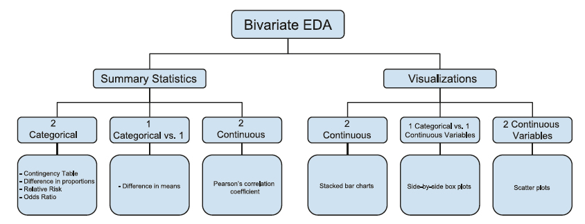
Figure 11. Summary of bivariate exploratory data analysis.
Conclusion
Univariate and bivariate summaries and visualizations maximize data insights by revealing patterns, relationships, and anomalies. Exploratory data analysis helps answer initial questions and examine assumptions beyond formal hypothesis testing and modeling. Although not covered in this paper, the treatment of outliers, missing data, and overall data cleaning are also important applications of EDA that ensure data quality. The insights gathered in EDA can be then used for more sophisticated data analyses and modeling.
Conflict of Interest
The authors declare that they have no conflict of interest.
Funding Sources
The study did not require funding sources.
Author Contributions
MCV, IZ: Content outline and investigation of paper references
MCV: Write-up, analysis interpretation, and edits
IZ: R analysis and code
All the authors read and approved the final version of the manuscript.
REFERENCIAS BIBLIOGRÁFICAS
Resources:
Introductions to R language:
Best Practices and Guides:
Velasco M, Zhao I. Descriptive Statistics - An Introduction to Univariate and Bivariate Exploratory Data Analysis. Metro Ciencia [Internet]. 30 de septiembre de 2021; 29(3):53-62. https://doi.org/10.47464/MetroCiencia/vol29/3/2021/53-62